
QGIS is an open source Geographic Information System (GIS) application which can handle most data formats, and is highly extensible with an included plugin installer. It is tolerably durable and extremely capable, and is able to produce basically any sort of map you would like. It runs on most everything and will cost you nothing. It also has a server which can be run in tandem or standalone, or in a container, and which can also serve a web client directly.
I've been working on putting together a suitable map for public safety use, with all of the streets labeled and all of the relevant points of interest displayed, and was finding it to be something of a hassle using free web-based options. While looking for tools to help manipulate map data for use with my self-hosted mapserver, I came across QGIS. It was relatively easy to install the latest version on Devuan, and it's been fairly stable. I have been able to blow it up by throwing an absurd amount of data at it, but I do have a fair amount of PC to work with here1 so there's no resource excuse to fall back on. Still, it's unbeatable for the price, and a little respect for some reasonable expectations will go a long way. For example, not loading layers for the streets of counties you don't need can make immediate improvements in performance.
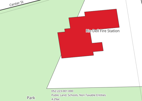
I based my map on the US Census Department's TIGER 2024 data. You can realistically swap layers any time you like, within reason. Some maps have additional data tied to IDs embedded in their vector files, which won't translate to other line sets. Point data including "Points Of Interest" (POIs) is typically coordinate-based (whether a single point or multiple connected points, such as a building outline) and aren't connected to streets. The ability to easily change which map layers are active is a powerful aspect of GIS, allowing the user to view data in multiple contexts.
I've been collecting mapdata for a long while, and downloading TIGER data is a potential subject in itself which I don't want to get bogged down in now. But from a naive and barely-educated viewpoint, the complicated parts of GIS besides acquiring the data from a variety of government websites operated with assorted competence are controlling how the data relates to other data, and how the data is displayed. My interest in the former thing so far is limited mostly to how the locations of things are related, and drawing them on the map satisfies that need, but I knew already from fiddling with mapserver and leaflet that the other task is a huge aspect of the job.
This is where I think QGIS is most remarkable among powerful open source software, because it genuinely makes this relatively easy. It is not easy, but it is not any harder than it has to be due to being inherently complex. The style, placement, color, content, and every other aspect of every item can be controlled, but more than that, also has a reasonable default. I cannot really express how important, unusual, and time-saving this is. If you do not set the sub-options for the various options you turn on, for example that a label should be drawn for a map feature, you will still get something reasonable. And if you want to change an option, you will find it in a logical location, and you will not find it difficult to change. The interface is really just excellent. YMMV on non-Unixlike platforms, which I have not explored, but I expect it generally works fine.
My workflow so far goes like this:
- From a new project, use the Data Source Manager to add some data to the project. If clarification is required of how the data is to be used, then the software prompts for it; otherwise the various items selected (single or multiple) are added to the project's Layers. These can be rearranged, which is relevant both for organizational reasons and because they are drawn top to bottom. If needed, import some data from OpenStreetMap into more layers, with the QuickOSM plugin. Rename layers as needed and create some layer notes which explain things about the layer and give a pointer to where to get more information. The notes are in HTML, so I include links. I also note the dates, and if there is a blurb or a readme, then I put that in there too.
- Select the Identify Features tool from the Attributes Toolbar and click on whatever doesn't look like I want it to, maybe after scaling up and down a bit to determine at what scale I want to see it on the map (or for it to look a specific way at whatever scale.) This reveals its attributes, and also tells me which layer it's on. If the thing is on a layer I've just created from OSM, then I'll maybe even enable editing on the layer and make some changes to some of the attributes (like filling in a name, mostly) since that's my layer now. I save layers like that alongside my project file.
- Create styles for items identified in step 2, which determine colors, line styles, labeling, and basically any other visual property you might need to control for elements of a map.
- Repeat prior steps as necessary.
You can output all sorts of maps from the software, including PDFs for printing, or bitmaps for display on the web. After just a few days I succeeded in producing something better and more usable than what we were able to source previously, and as shown in the detail above, when you zoom in on the map it starts to show you information on parcels. I'm also starting to add information on flood zones and fault lines; map layers are drawn in order, and you can turn them on and off in groups so it's easy to draw maps with any kind of combination of features.
- 1
5900X, 64GB RAM, 16GB GPU